Blog Post
Add an Emoji Favicon to your site
Originally I posted this to my dev.to profile in Nov, 2018; you can read it here if you'd like. I decided to repost it on my blog, since I wrote it and all.
For my first post I thought I'd share a short little trick I learned that makes websites look better!
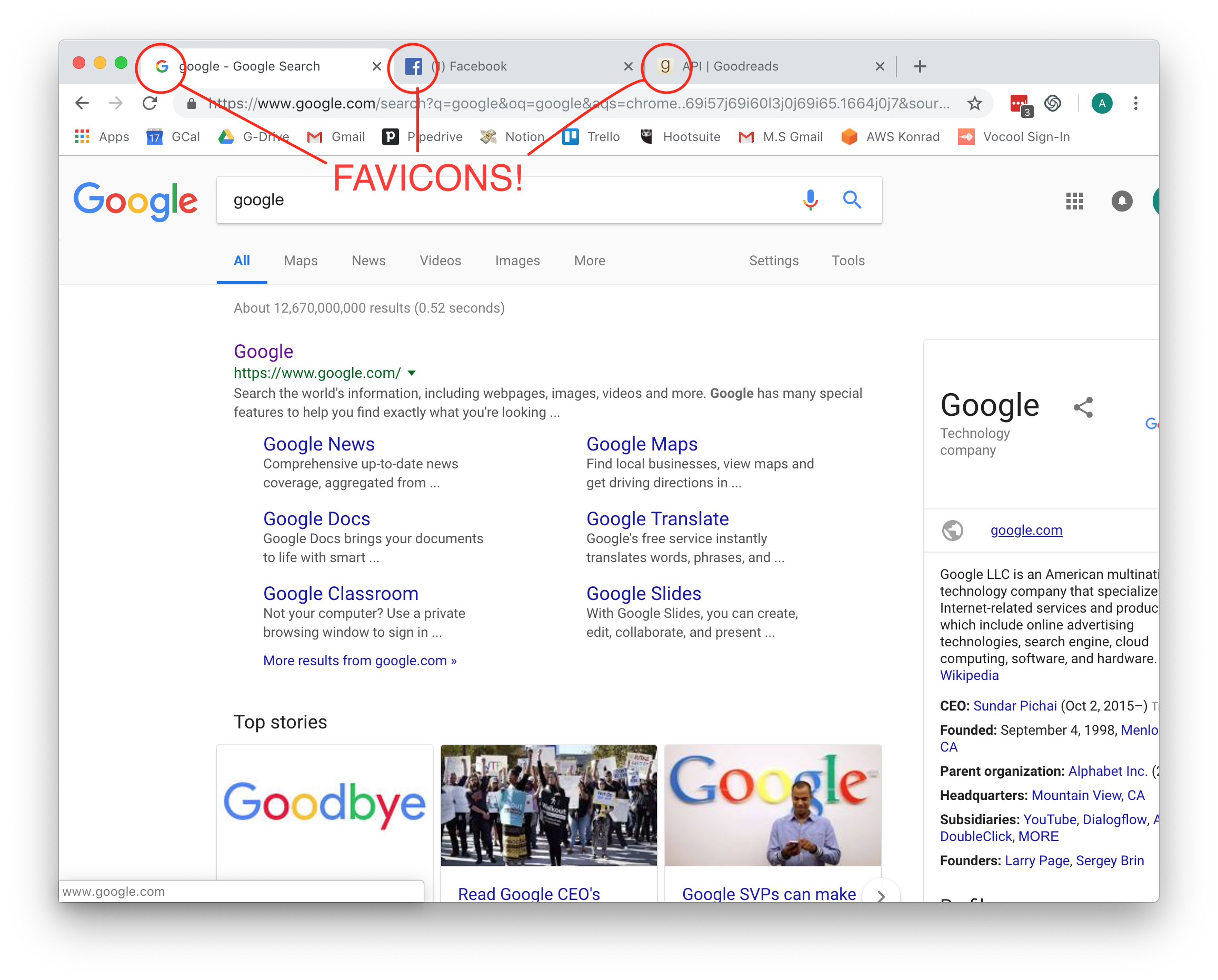
For starters, if you don't know what a favicon is, don't fret! I didn't until recently. Its the small thumbnail on your tab. If you use Google Chrome, it looks like this:d

I've been working on a project for CS50 for web-programming class. The assignment: build a book review website, using Flask and PostgreSQL. While I was working on it, I got bit miffed that my site wasn't looking professional. I was using Bootstrap, for the ease of formatting, but that wasn't looking great, a tad better than the default. I decided adding a favicon would help a bit, but I didn't want to mess with making a logo or finding a picture and scaling it, so I thought. Would an emoji would work? It did, fantastically!
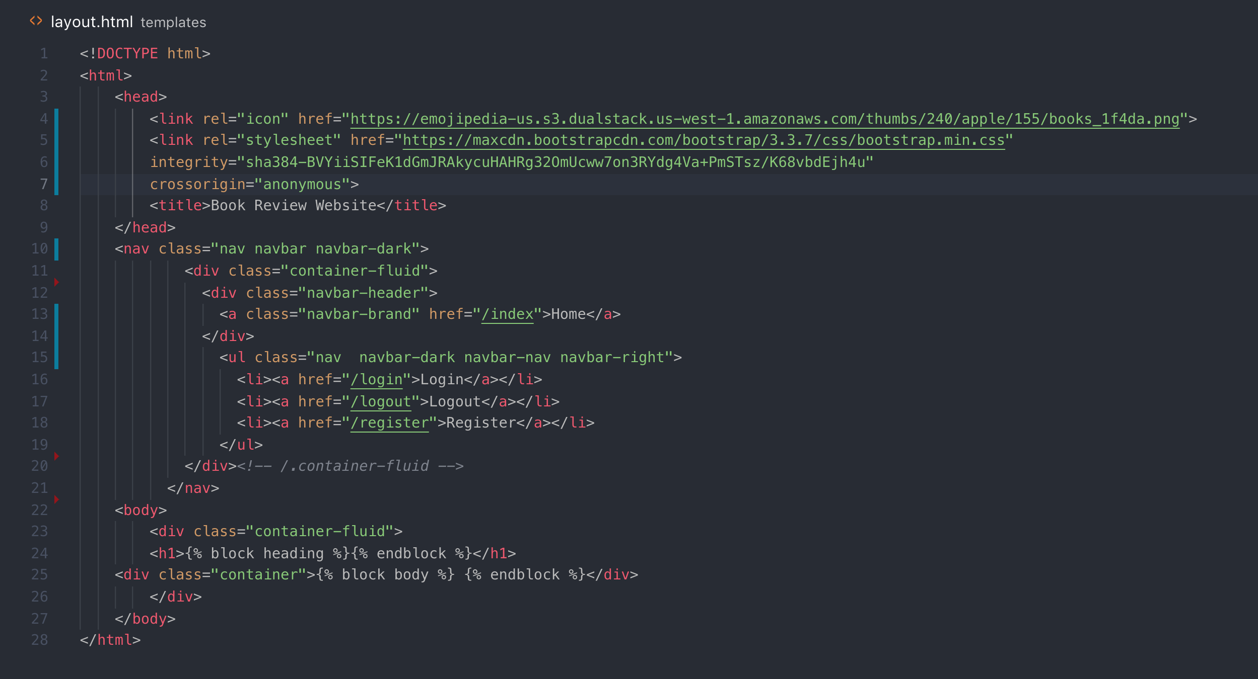
I decided it would be painless to find the emoji I wanted and add it to my <head> of my template.html. Here's how the code ended up looking:

This adds a great touch, and if a user is like me and has 15 tabs open at all times, the favicon, would help them find the correct page.
Here's how I did it:
- Head to emojipedia.org
- Find your emoji.
- Right-Click on the emoji style you prefer (I chose the Apple version)
- Copy the link and insert into your
<head>tag like so:<link rel="icon" href="https://emojipedia-us.s3.dualstack.us-west-1.amazonaws.com/thumbs/240/apple/155/books_1f4da.png">OR if you are using GatsbyJS you can download the file and save asfavicon.icointo your static folder and it will inject it for you!.
And you're done! I was using flask for this project, so I put this in the layout page and it dynamically puts in on any template that has the {% extends "layout.html" %} at the top of the .html doc.
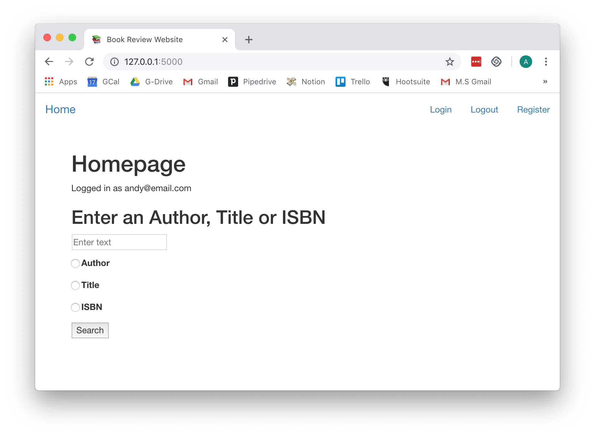
Here's how it looks!

Thanks for reading! If you liked this, let me know. If there's a way it could be better, let me know! Feel free to follow me on Twitter or Github!